
Let’s talk about Japanese Web Design defying most UX rules (and why it kinda doesn’t)
Let's make one thing clear first, as I’m writing this because I’ve seen the opposite claim circulate a lot online. Japanese websites don't break UX rules. They break our UX rules, and the fact that we call them universal says more about where the rulebook was written than about whether or not people read it.
When researchers ran design-feature analysis across thousands of sites internationally, Japanese sites came out measurably more colourful, more densely packed with text and images, and far less reliant on whitespace — which reads as a violation only if you've been taught that empty space is the same thing as clarity. When a few analysis are run on why this happens, Edward Hall's distinction between high- and low-context cultures is the usual explanation and it isn't wrong, but it gets applied lazily.
The terms come from anthropologist Edward Hall. In a low-context culture, meaning lives in the message: you say what you mean, the words carry the information, and anything important gets stated out loud. Germany and the US sit at that end. In a high-context culture, meaning lives in everything surrounding the message: shared history, relationship, hierarchy, silence, the situation itself. Japan sits firmly at that end.
I would argue that Italy does too, although it’s a point of contension. My grandmother can communicate profound disappointment in my life choices by glancing at how much pasta I've left on the plate. No words are exchanged. The message is received in full, with formatting.
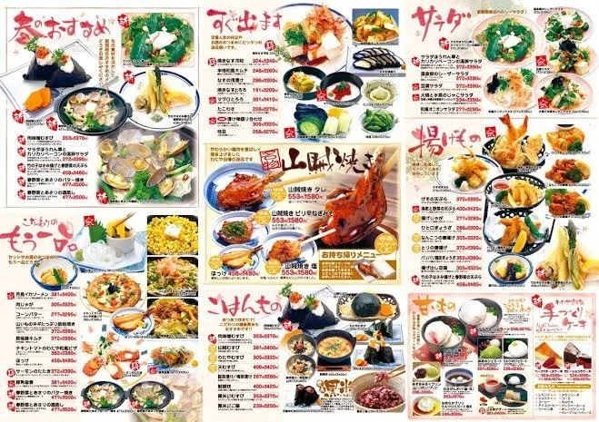
The interesting version isn't "Japan is high-context, therefore clutter." It's that a high-context culture can produce the opposite of what you'd expect in commerce: not implication, but total disclosure — every spec, every shipping option, every seal of approval, visible before you're asked to trust anyone.
Then there's the part that has nothing to do with culture and everything to do with the material. Japanese is written in three scripts at once, and kanji carries so much meaning per character that a line of Japanese simply says more than a line of English — density is partly just what the writing system does. It also removes the tools we lean on: with limited bold and italic, emphasis has to come from somewhere else, so it comes from colour, borders, drop shadows and gradients — the exact vocabulary Western design filed under "dated" a decade ago.
Layer on the technical history — the i-mode and feature-phone era trained a generation to scan link-heavy layouts, and portal-and-SEO legacy set the expectations that followed — and the "clutter" starts looking like an accumulation of sensible decisions rather than an aesthetic failure. Compare Rakuten's domestic site with its global English one and you're not looking at one company doing design well and badly. You're looking at two entirely different user experiences, built on purpose.
To read more on the topic please check out:
A Wall of Text and Flashing Banners: Why Japanese Websites Look So Different | by Meri Sargsyan | UXCentury | Medium +4
So is that why we adapt digital tools to our audience? Yes — but here's where "Japanese web design is maximalist" falls apart as a claim. It isn't one style, it's two. Mass-market domestic sites lean dense and high-trust; premium, craft and global-facing work leans spare and built on ma (間) — not whitespace, but the deliberate interval that gives an element weight, which is why luxury, hospitality and museum sites use it. Japanese designers have both registers and choose between them, which is more design literacy than most Western studios can claim with their single house minimalism applied to everything from a bank to a bakery (I said what I said). The lesson here isn’t to let yourself be inspired by a new, different, trend. It's that design is, before being visual, an audience-appropriate choice — and a spare Western layout aimed at a domestic Japanese mass market may simply underperform a richer one. The minimalism that promised neutrality is a dialect that people are selling as grammar.