
Spotify's New Plus Button: A Step in the Wrong Direction?
Spotify's Heart Button Update: A Case Study in Minimalism Gone Wrong
It's been over 5 months since Spotify made the controversial decision to replace its heart button with a plus button. The update was met with widespread disapproval from users, who fled to social media to voice their disappointment.
In this article, we will take a closer look at this Spotify update and its impact on users. We will also discuss the role of minimalism in UX design and why it is important to be careful not to oversimplify things.
Acknowledgments:
I will be the first to admit that I am against this Spotify’s heartless update. I have always been a fan of the feature (I unapologetically hearted over 1300 jams in my Spotify career), and I believe that it is a much more intuitive and expressive way to show your love for a song. Moreover, I also am not particularly fond of the oversimplification trend in all things UI as i believe the human mind is designed to enjoy a certain level of complexity.
Why I find this case study interesting:
Despite my bias, I find the Spotify button update to be a fascinating case in UX design. It is a clear example of how even seemingly small changes to a user interface can have a big impact on the user experience. Okay, that’s all I needed to say before starting with my lukewarm take on this case. Let’s dive in.
Spotify, the music streaming giant, recently announced that they would be replacing the heart button with a plus. The company said that the change was made to make it easier for users to add songs to their library.
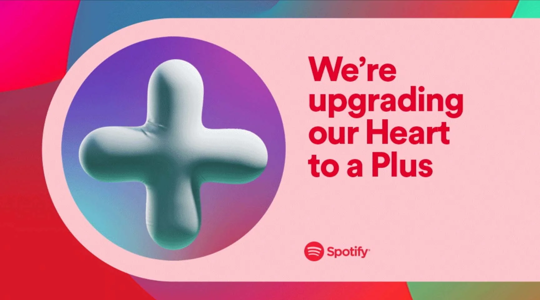
However, many users have expressed their disapproval of the change. The plus button, which was already present in the app, was previously only used to add albums and playlists to your profile.
Spotify has defended the change, saying that it is "making it easier for users to find and listen to the music they love." However, many users are not convinced. They believe that the change is unnecessary and that it has actually made the user experience more confusing.
Some widely-accepted cons from a UX perspective:
The plus button is less intuitive. The heart button was a clear and concise way to express one's appreciation for a song and automatically added liked content to a liked playlist. The plus button is more ambiguous, and will also allow for the song to be added to different playlists. This is the type of ambiguity that can lead to confusion and frustration in users.
The plus button is less consistent. The heart button was consistent across Spotify's different platforms. The plus button is not yet, at least on my devices. This can lead to users wondering if they should be "loving" songs on one platform and "adding" them on another.
The plus button is less expressive. The plus button simply doesn't have the same emotional resonance. The plus button doesn't provide a way to distinguish between adding a song to a playlist, and genuinely showing love and appreciation for a song.
Overall, the Spotify plus button seems to be a step backward in terms of UX design. This is why it’s so important in our job to work with people, not just for them. As a UX enthusiast I always like to mention the original definition of things: the word thing comes from ‘Old English þing, þyng, of Germanic origin; related to German Ding. Early senses included ‘meeting’ and ‘assembly’, ‘ matter, concern’.
At the heart of making things is the idea of having an open dialogue with your community, meeting with people to come up with a solution in a coordinated and collaborative effort.
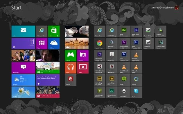
Remember when Windows launched a certain update that was supposed to revolutionise the way users interacted with the OS? They got rid of the START button. Time went by, people were unhappy, and back to the start button we all went.
If you think this all very sounds all very common sense-y, you’re definitely not wrong. “If it ain’t broke, don’t fix it” is something I loved to say well before I knew what UX even was. But of course, there are UX well-established theories to back this up.
Jakob’s law, for example is all about building familiarity (and humility). Why? Because ’users spend more time on other websites than on your website.’
The user, already familiar with a like button from social media apps, reinforces their ‘liking’ habit by using the same function across different platforms. This familiarity loop will then prompt the user to repeat the same action more often and with more confidence. On the other hand, featuring a different button for a certain function will create friction and it will be harder for the user to familiarise with it. We really are creatures of habit.
Takeaway lessons for UX designers:
Even seemingly small changes can have a big impact on the user experience.
UX is just like a Marathon training plan: consistency is key. Make sure your designs are consistent across platforms. Repetition forms a bond with the user, through familiarity and comfort. Never underestimate the power of that. [That’s the main cause of the Internet insurgence against the update.]
Use symbols and icons that are familiar and intuitive to users. This is a good rule of thumb to help to make your designs more user-friendly.
Consider the emotional impact of your designs. Your designs should be more than just functional; they should also be expressive and meaningful.